
My Illumination & Calligraphy Projects, Sacred Geometry
Illumination & calligraphy
There are two illumination projects that took me several months because I can only work on them when I’m inspired (and therefore motivated enough to overcome the obstacles).
The first project is a facsimile of the “Genesis” page from the 42-line Gutenberg Bible. The sheet was printed at the press at the Gutenberg Museum in black, blue, and red.
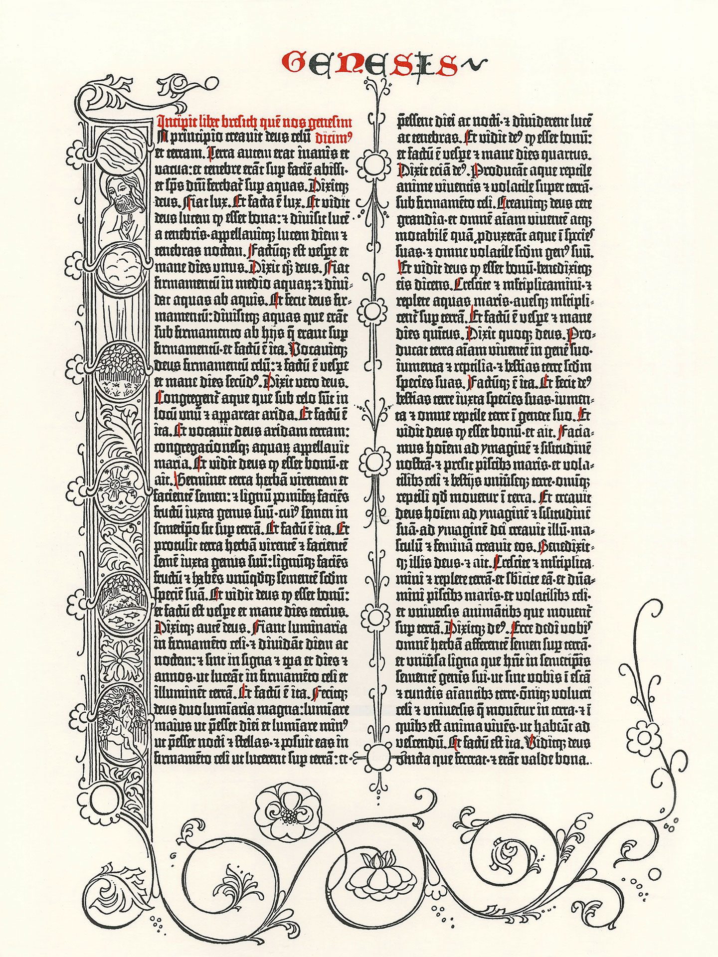
However, the designs are not colored; I added the gilding and colors myself. I didn’t realize the beauty of this document because it was a difficult project due to the poor quality of the paper (too thin). The project didn’t bring me much joy. The half-illuminated/painted sheet sat on my desk for weeks. Then, when I finished it, framed it, and looked at it every day, I realized how beautiful it was. The gold leaf brings luminosity to any medium. Every time I enter the living room where the facsimile is, I’m struck by the brightness of the gold touches I applied, especially if it’s lit by the sun. I understand better why some people tear out folios from illuminated books to sell them individually. Because each folio is itself a work of art. For Gutenberg Bibles, very few remain intact because each original folio can sell for around $100,000 (according to a podcast I listened to).
You can learn more about the genesis of this project here.

The second project is a double illuminated leaf. Since I heard about the Duke of Berry and his books of hours, I’ve been more drawn to the Belles Heures than the Très Riches Heures. I particularly like the ornamental decorations on every page (rinceau borders). In other books of hours, these borders are more colorful and have less gold. And I really like that these are very golden.
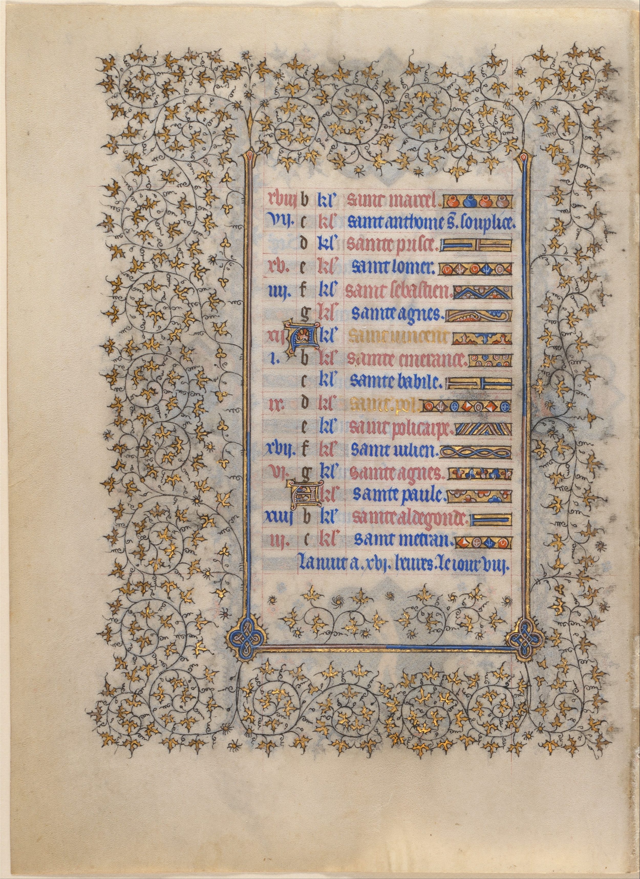
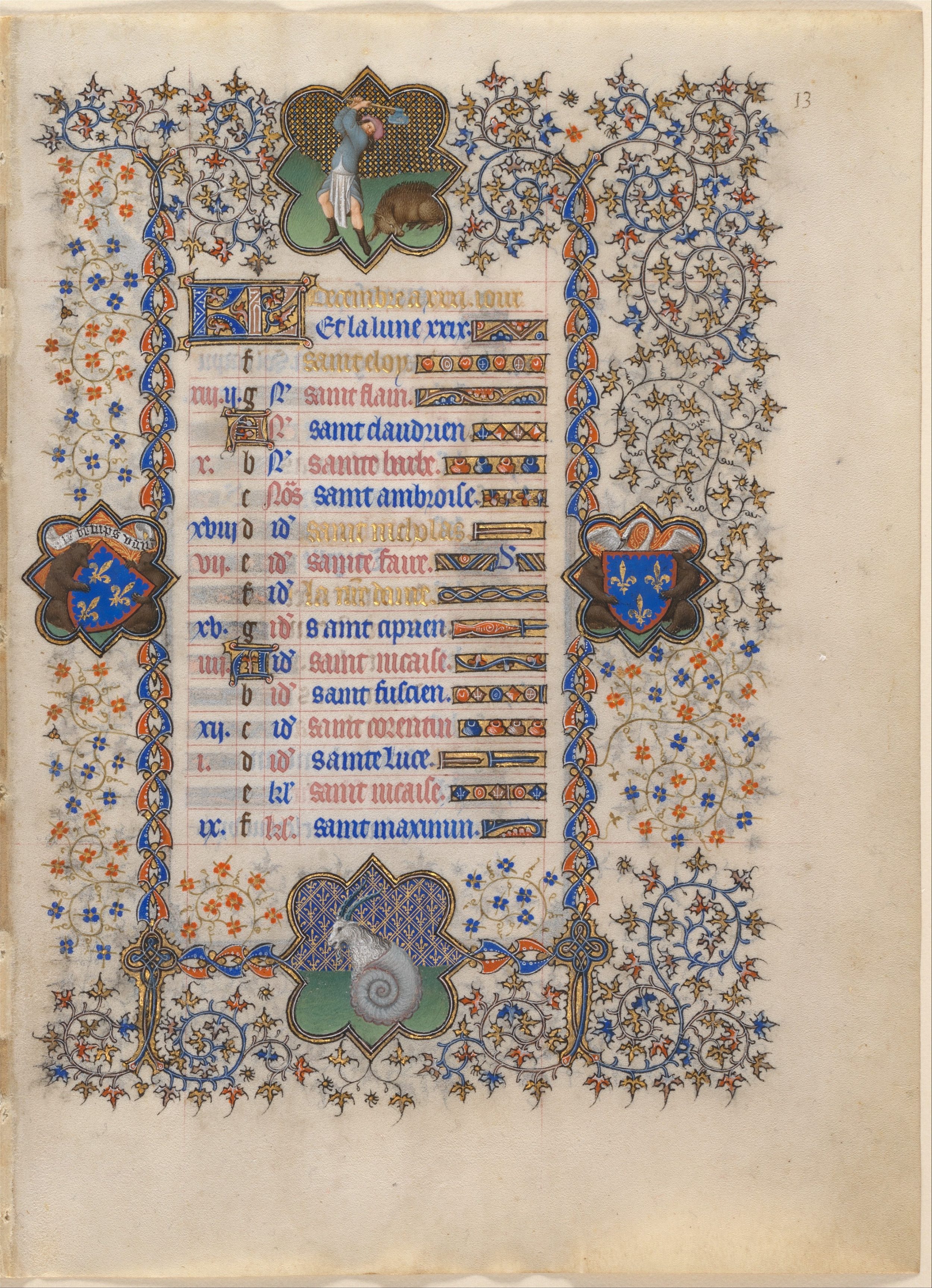
I saw this book in person and was struck by its small dimensions. I went with even smaller dimensions (due to lack of parchment). I had to vectorize the borders (I did it by hand, tracing with my reMarkable), and adapt them to the new dimensions I chose. For the text, I chose the Emerald Tablet, a short text that suits me perfectly.
In the Belles Heures, the typeface used is the gothic script called littera textualis. For my text, I chose the textus quadratus because I have this font on my computer, and it’s easier for me to do the layout on the computer (estimating the number of words per line, line spacing…) than to recopy the text 10,000 times to finally find the right layout. The dimensions of the text block and the margins follow the golden ratio, and the basic visual rules of layout, etc. To achieve all these dimensions and ratios, I had to spend several weeks reading about sacred geometry. The research was super intense. Because it’s one thing to copy faithfully, but quite another to just “be inspired.”
In short, you’ve understood well: this is my very first calligraphy project. I had to trace the alphabet several times like a child, then trace the text laid out by the computer, and then recopy the text onto the parchment.
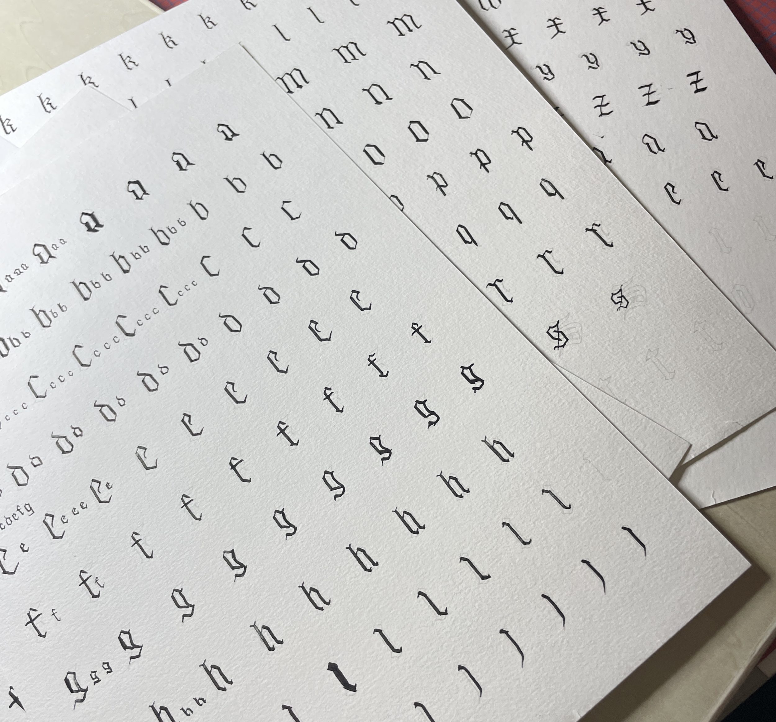
I admit I made many mistakes, but the advantage of parchment is that you can scrape off errors with a cutter, just like medieval calligraphers did.
Here is the result. A lot of energy and neurons were spent on this project.
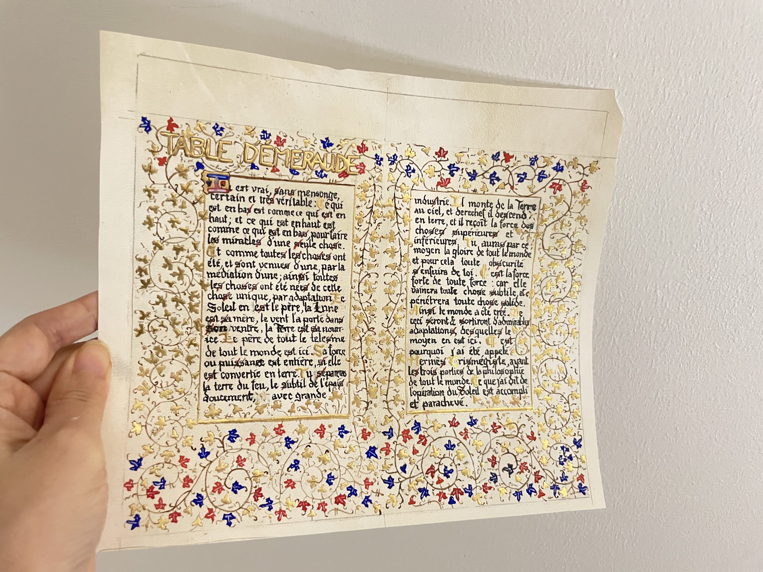

I admit I knew it wouldn’t be perfect, so the project was done on low-quality parchment, and I tolerated calligraphy mistakes. The nib used for calligraphy isn’t the most suitable for gothic scripts, but you have to start somewhere. I did small tests on a little piece of parchment, but you don’t make the same mistakes on test pieces as on the full project.
It’s my first step toward more ambitious illuminated book projects. You can learn more about this project here.
Sacred geometry
To calculate the dimensions of my illuminated leaf, I hesitated a lot between A5/A4 format (thus using the square root of 2) and the golden ratio. I had to consult countless documents on sacred geometry to decide.
My quick visit to Amiens Cathedral reminded me how much I love rose windows. So I embarked on paper cutting of two rose windows (using my Silhouette machine).
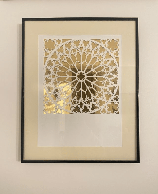
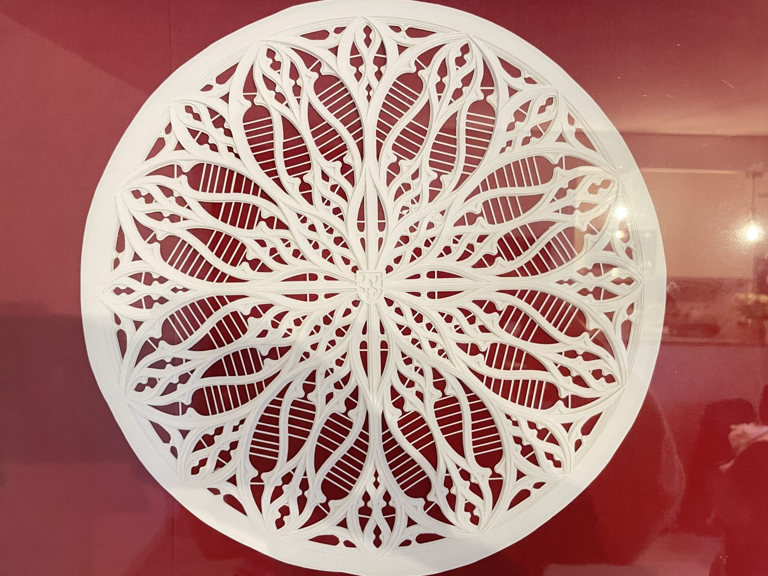
Since the paper cuttings have between 4 and 8 layers of paper, you can see a very pleasant 3D effect. The machine cutting took an entire day, so imagine how long it would have taken if I’d done it by hand. You can learn more about this project and buy the templates here.
The good news for rose window lovers is that there are several 19th-century books that explain how to draw a rose window. And there are people whose job is just to study rose windows and figure out how they were drawn (more info).
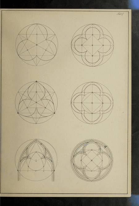
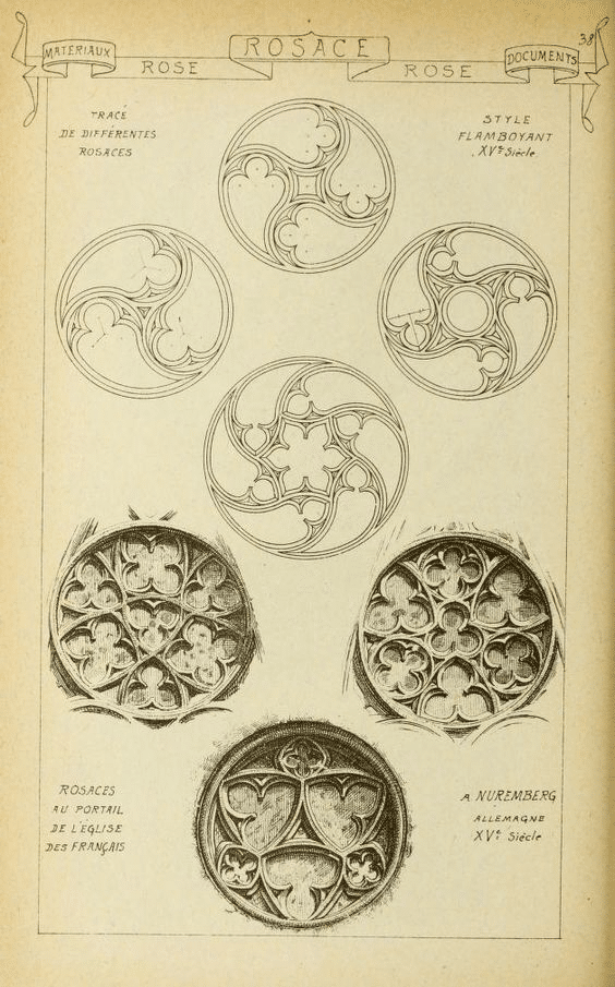
There are many more resources on Islamic patterns. I highly recommend the two books I borrowed from the library:
- The Art of Islamic Patterns (Amazon link)
- The Art of Islamic Patterns: A Workshop (Amazon link)
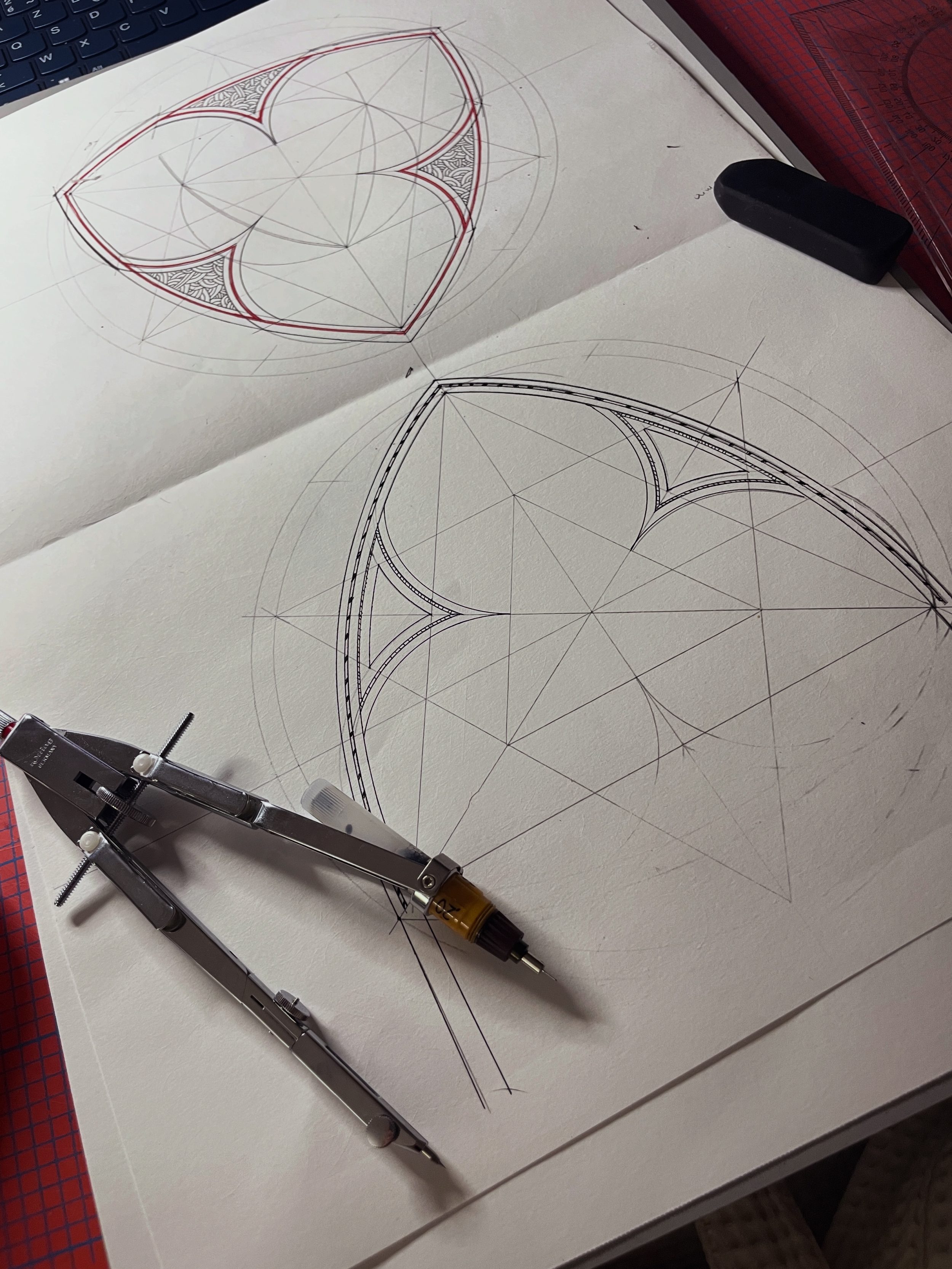
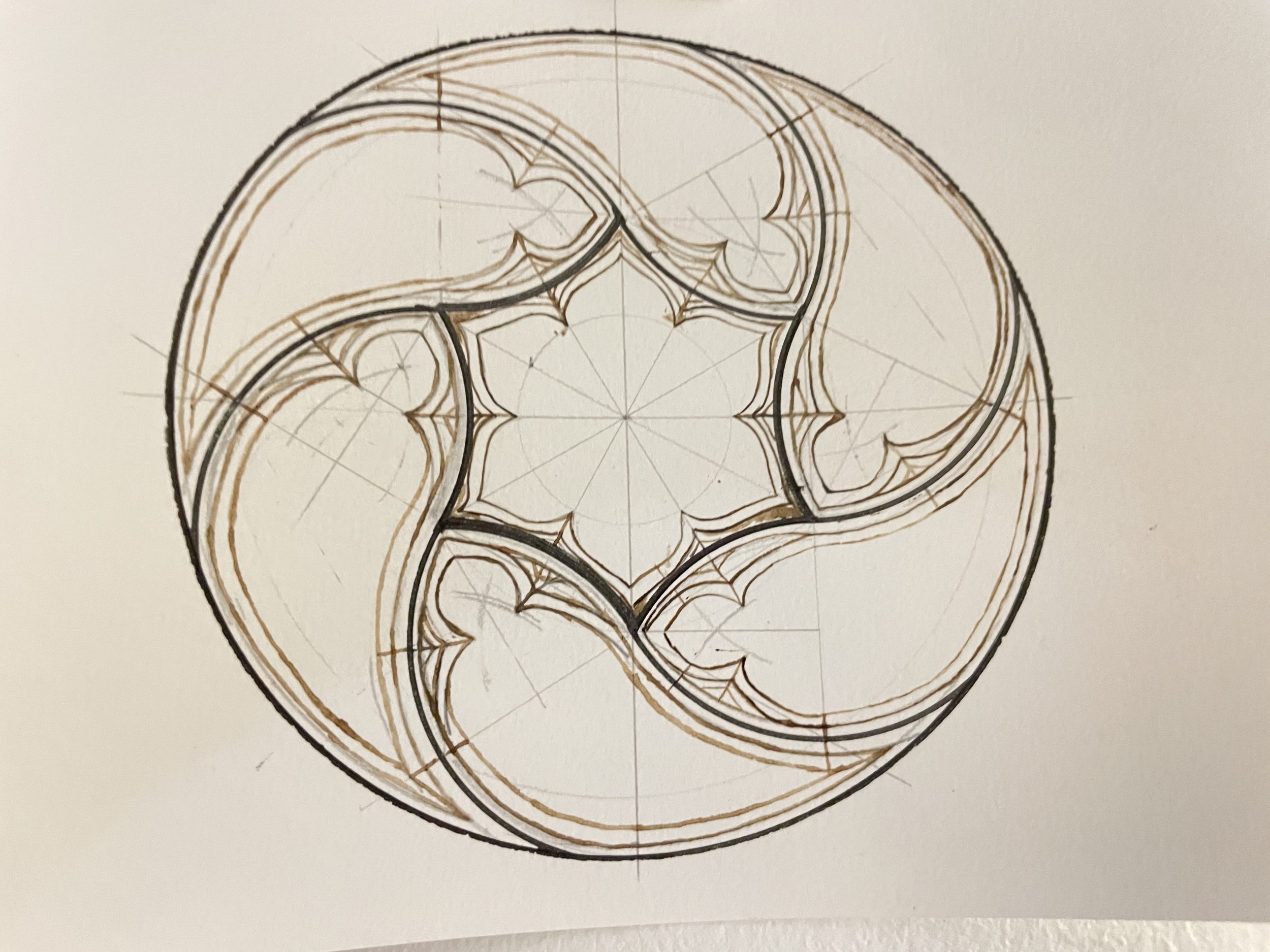
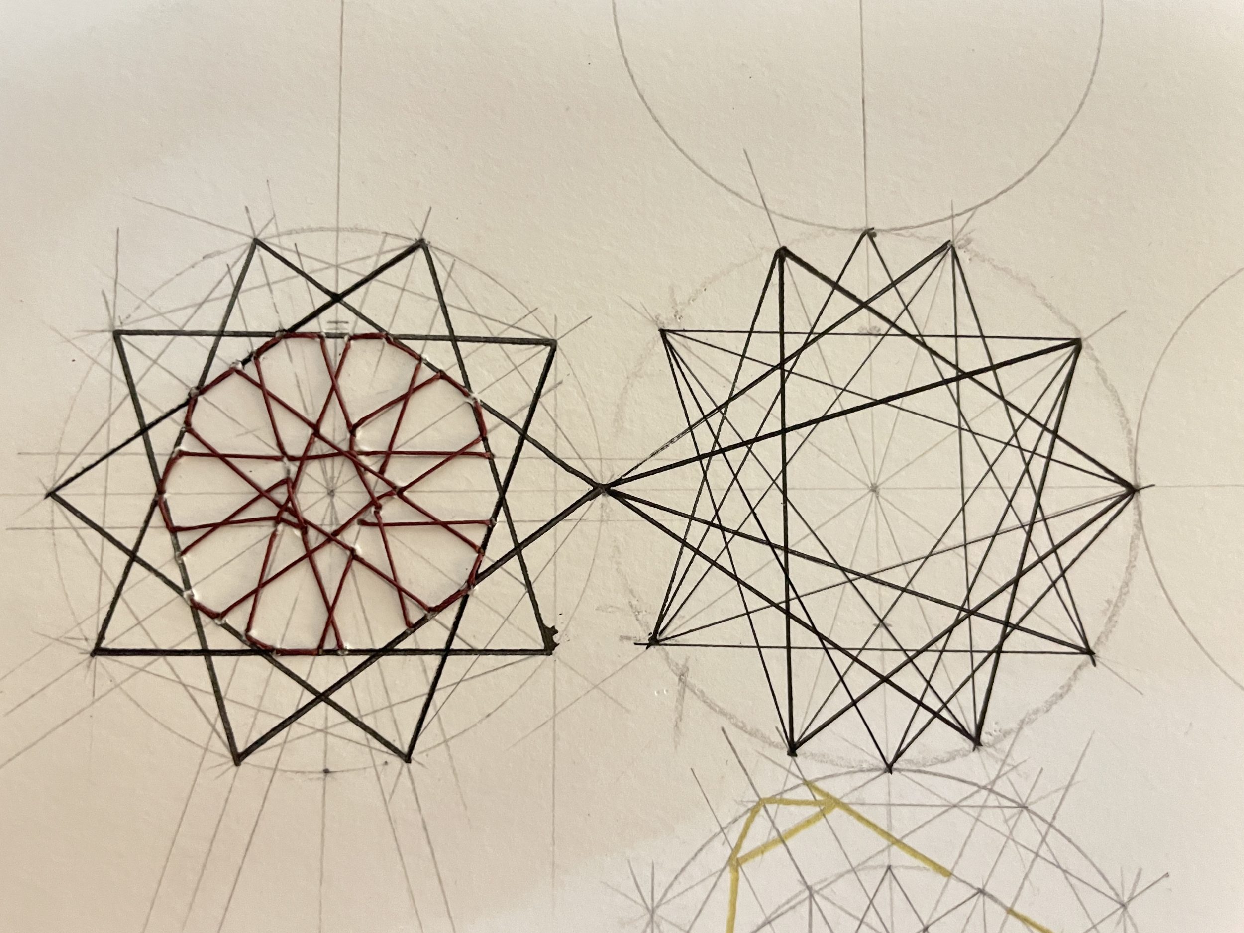
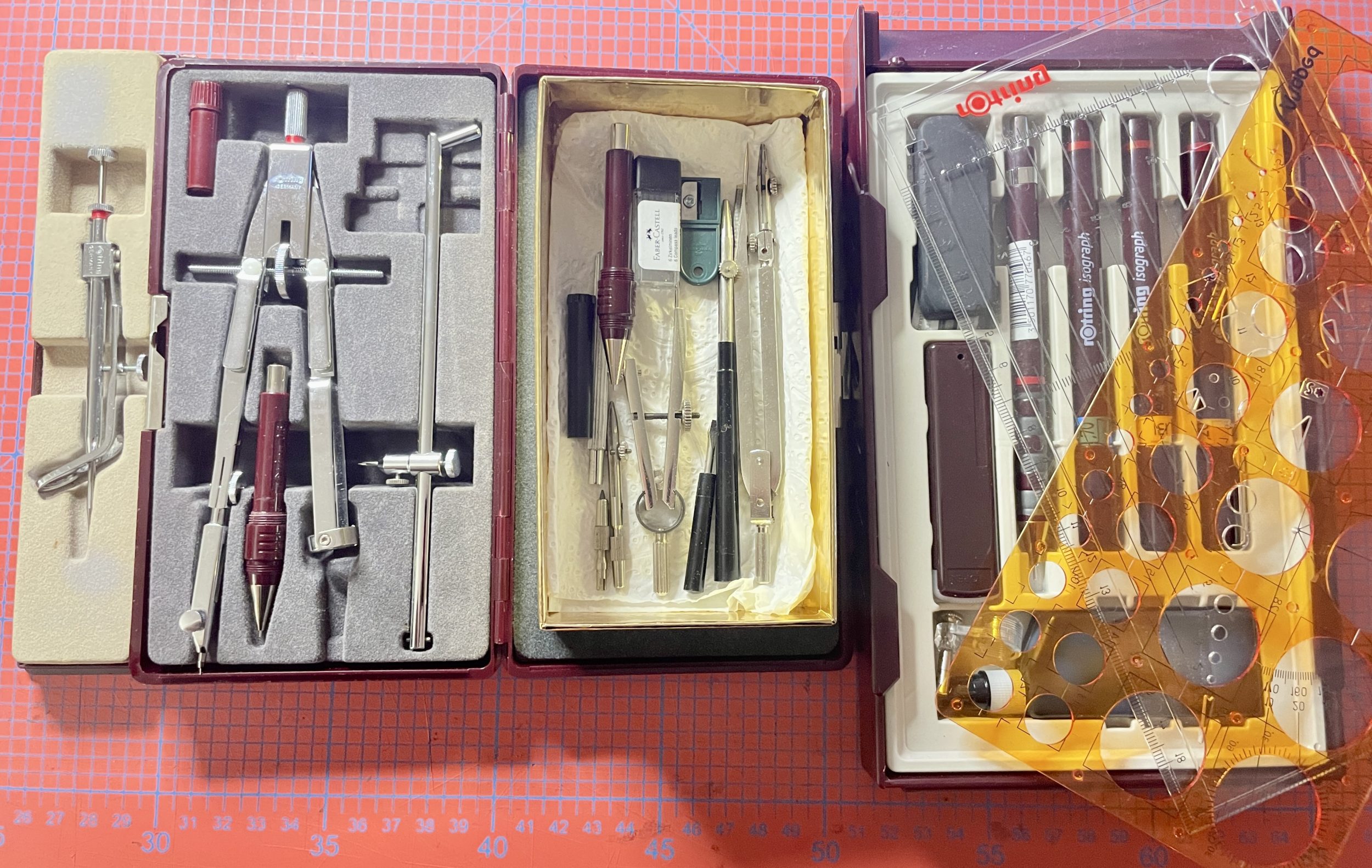
The diagrams look easy, but whatever the pattern, it gives me big sweat drops and a lot of test and learn. For technical drawings like this, you also need tools meant for architects. I had to dig through Leboncoin and Vinted to find vintage compasses, ruling pens, and isograph pens. I highly recommend the brand Rotring.
Arabic calligraphy
Anyone interested in Islamic patterns is inevitably interested in Arabic calligraphy. Illuminated Qurans combine both. On the binding, you’ll see beautiful Islamic patterns. Inside, there are beautiful floral motifs, illumination, a geometric gold border, and Arabic calligraphy.
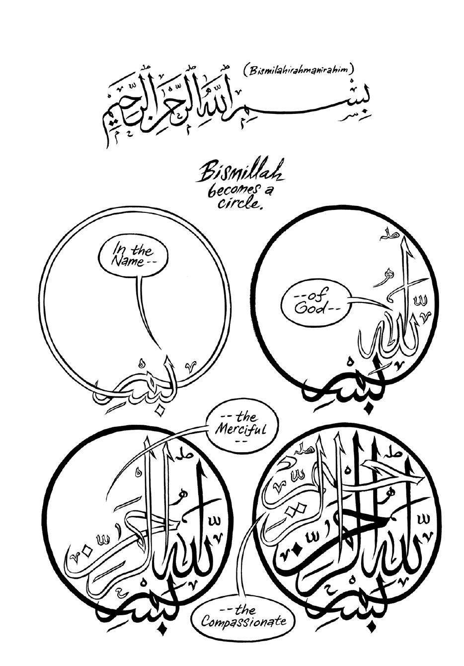
In “Habibi” by Craig Thompson, the author briefly explained how Arabic calligraphy works and how to read it.
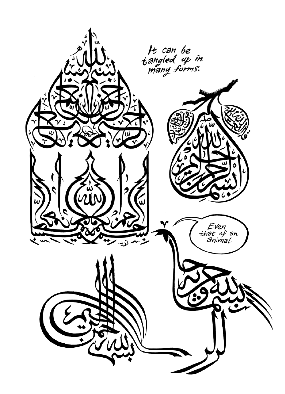
Here is my pen reproduction of a calligraphy of the phrase bismi-llāhi ar-raħmāni ar-raħīmi] بسم الله الرحمن الرحيم] (“In the name of God, the Most Gracious, the Most Merciful”) in the shape of a pear. It’s the opening formula found at the start of every surah in the Quran (except one).
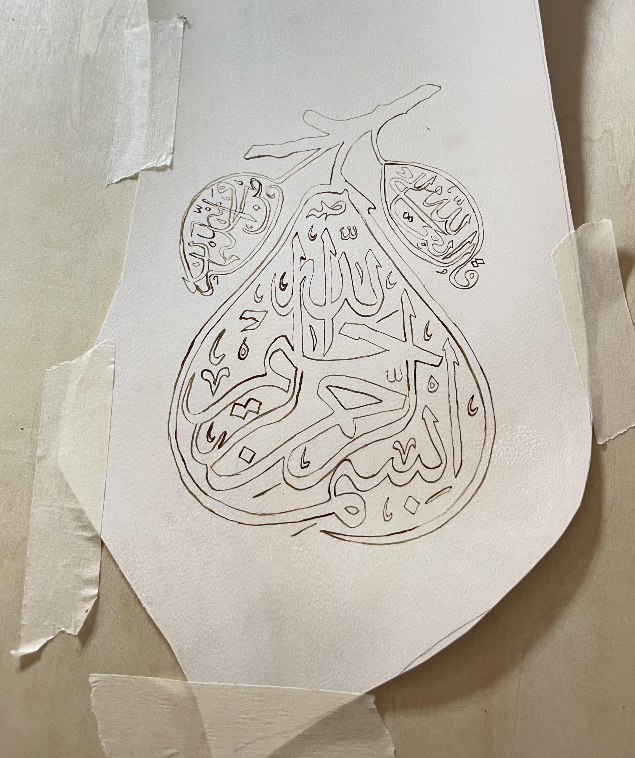
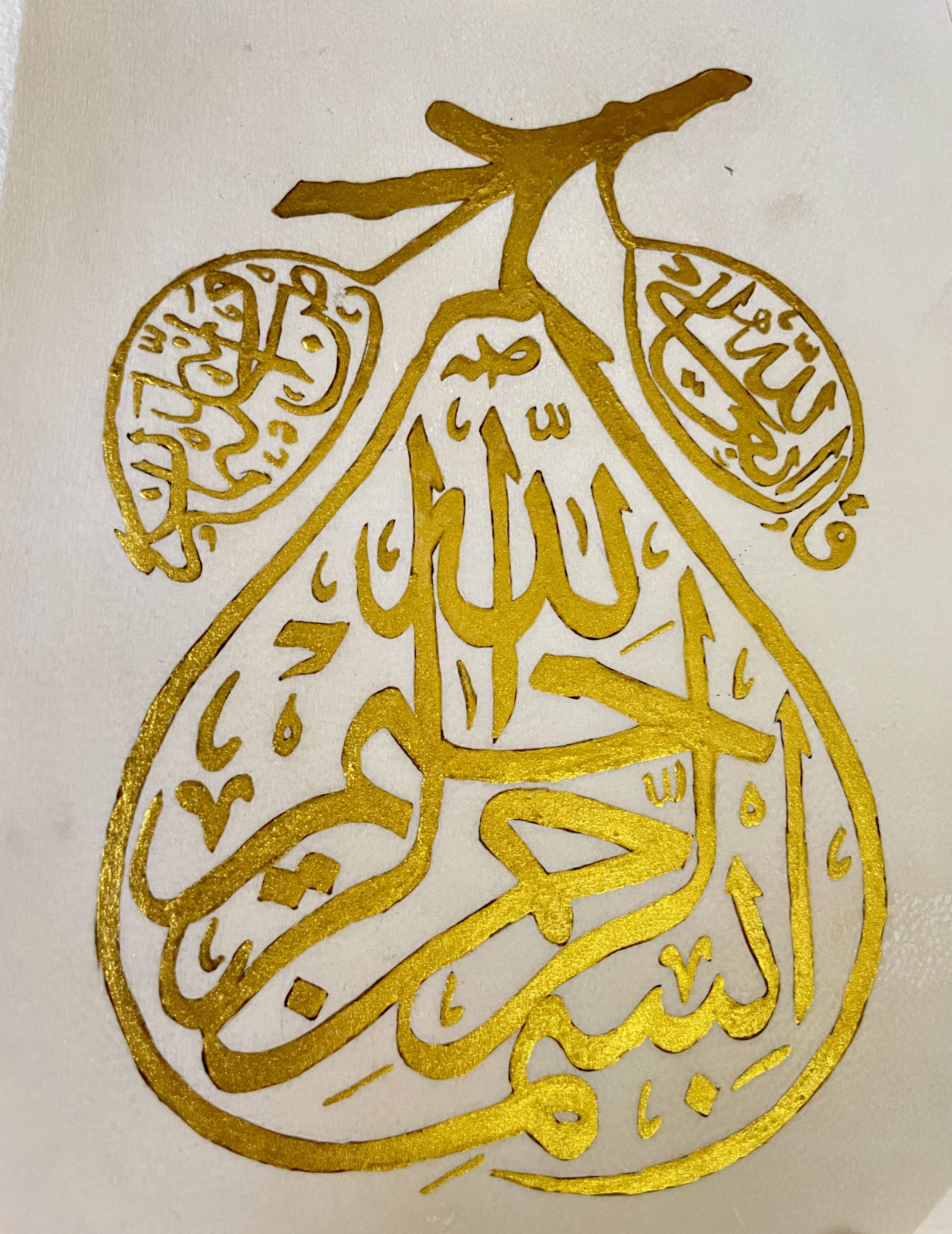
Right page: Qāla allāh ta’ālā] (“Allah, the Most High, has said”).
Left page: Wa innahu min Sulaymān] (“And it is from Solomon”), because the Basmala first appears in the Quran in a letter from Solomon to the Queen of Sheba (Surah 27, An-Naml).
